The Psychology of Color: Picking the Right Paint for Every Room
When it comes to designing a home, paint is more than just a decorative choice—it’s a powerful tool that can set the mood, enhance functionality, and even impact your well-being. Whether you’re building your home from the ground up or giving your current space a refresh, choosing the right colors can make all the difference.
At True Texas Builders, we believe in creating homes that aren’t just beautiful, but also thoughtfully designed for the way you live. Let’s break down the psychology of color and how to pick the perfect hues for every room in your home.
The Power of Color in Home Design
Ever noticed how some rooms feel cozy and intimate, while others feel open and energizing? That’s the power of color psychology at work.
- Warm colors (reds, oranges, yellows) tend to evoke energy, warmth, and excitement. They are great for social spaces where people gather.
- Cool colors (blues, greens, purples) have a calming and serene effect, making them ideal for bedrooms and quiet retreats.
- Neutral colors (whites, grays, beiges) provide balance and versatility, serving as a great backdrop for any design style.
Let’s dive into room-by-room color recommendations to make your home feel just right.
1. The Living Room: Warm & Welcoming
The living room is where family and friends come together, so it should feel inviting and comfortable. Warm tones encourage conversation and a cozy atmosphere.
Best Picks:
- Soft neutrals – Warm beiges, creamy whites, or greige (gray + beige) provide a timeless and cozy foundation.
- Earthy tones – Muted terracotta, soft gold, or warm olive green create a welcoming vibe.
– Avoid: Overly dark or bold colors that may make the space feel small and heavy.
2. The Kitchen: Bright & Energizing
The kitchen is the heart of the home—where meals are made and memories are shared. Lighter, cheerful colors work well in this space.Best Picks:
- Soft whites and off-whites – Keep things fresh and airy with shades like Swiss Coffee or Simply White.
- Warm yellows – A soft buttery yellow can add warmth without overwhelming.
- Light blues or greens – A soft sage green or sky blue promotes calmness while keeping the space lively.
– Avoid: Dark reds or overly intense colors, which can feel heavy and overwhelming in a kitchen.
3. The Bedroom: Calm & Restful
Your bedroom should be a sanctuary for relaxation. Cool, muted tones help create a peaceful atmosphere.
Best Picks:
- Soft blues and greens – Tranquil shades like powder blue, dusty teal, or sage green promote restfulness.
- Muted lavenders – A soft lavender hue adds a subtle elegance and relaxation.
- Warm neutrals – Beige, taupe, or warm gray create a cozy yet neutral space.
– Avoid: Bright reds or oranges, as they are too stimulating for a restful environment.
4. The Bathroom: Spa-Like Serenity
For a bathroom that feels like a relaxing retreat, opt for soothing colors inspired by nature.
Best Picks:
- Crisp whites and soft grays – A clean, refreshing choice that feels spa-like.
- Cool blues and greens – Ocean-inspired shades like seafoam green or powder blue enhance relaxation.
- Soft taupe or sand tones – A warm, natural alternative to stark white.
– Avoid: Dark or overly saturated colors, which can make a small bathroom feel even smaller.
5. The Home Office: Focus & Productivity
If you’re working from home, color can have a big impact on productivity and creativity.
Best Picks:
- Soft blues – Light blue enhances concentration and reduces stress.
- Muted greens – A sage or olive green can promote focus while feeling refreshing.
- Warm grays – A sophisticated neutral that keeps the space grounded.
– Avoid: Bright yellows or oranges, which can feel too energetic and distracting for a workspace.
6. The Dining Room: Elegant & Inviting
Whether it’s casual dinners or special gatherings, your dining room should feel warm and inviting.
Best Picks:
- Deep reds and burgundy – Red is known to stimulate appetite and create a rich, elegant atmosphere.
- Warm earth tones – Clay, terracotta, or deep olive green add a cozy and organic feel.
- Soft golds or taupe – A subtle warmth that complements different décor styles.
– Avoid: Cool blues, which may suppress appetite and make the space feel too sterile.
7. The Kids’ Room: Fun & Stimulating (But Not Overwhelming)
Kids’ rooms should be playful yet calming enough for bedtime.
Best Picks:
- Soft pastels – Light peach, mint green, or powder blue create a cheerful yet soothing space.
- Muted yellows or greens – A soft, happy vibe without being overstimulating.
– Avoid: Bright primary colors all over the walls—they can be too intense for relaxation.
Final Tips for Choosing the Right Paint Color
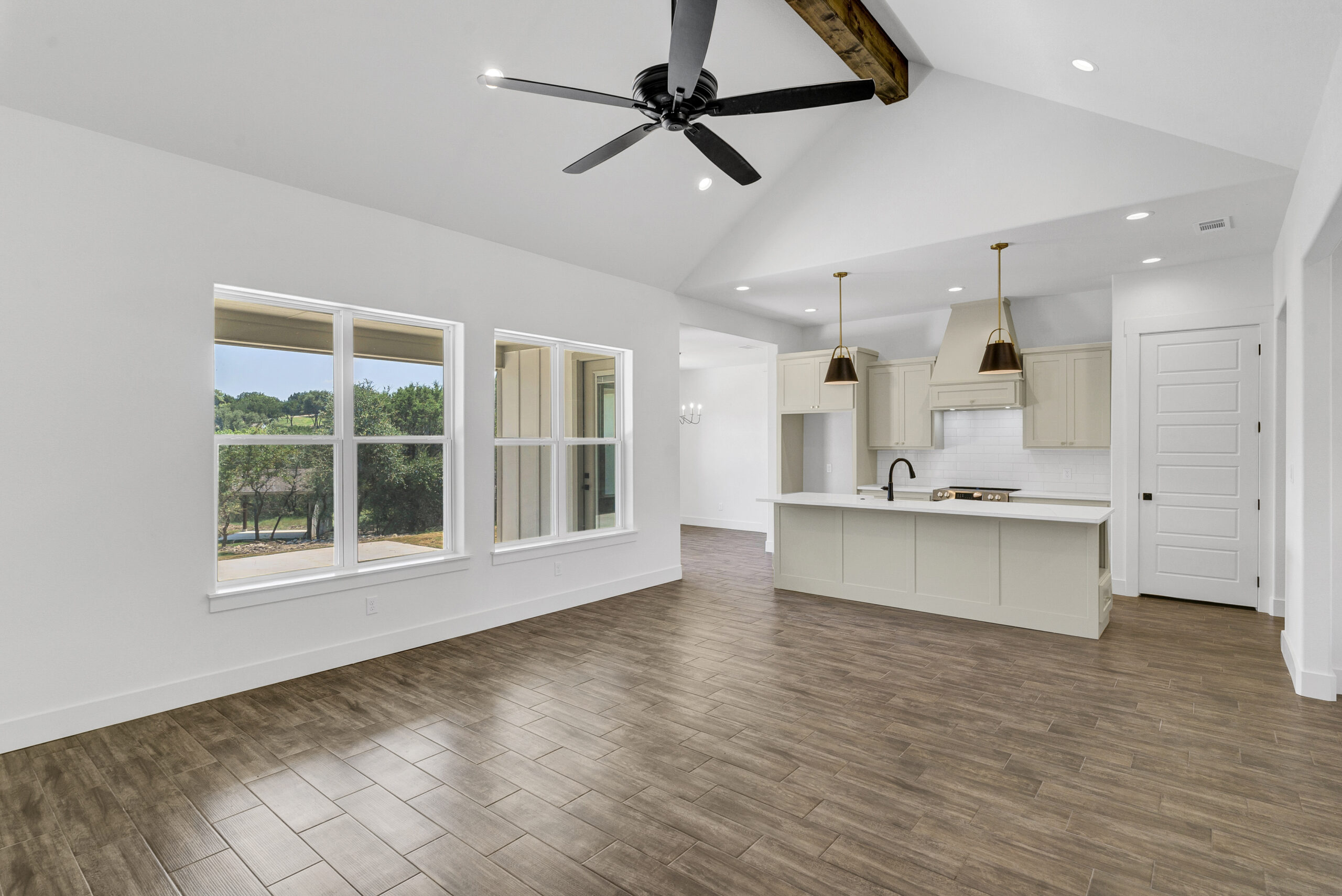
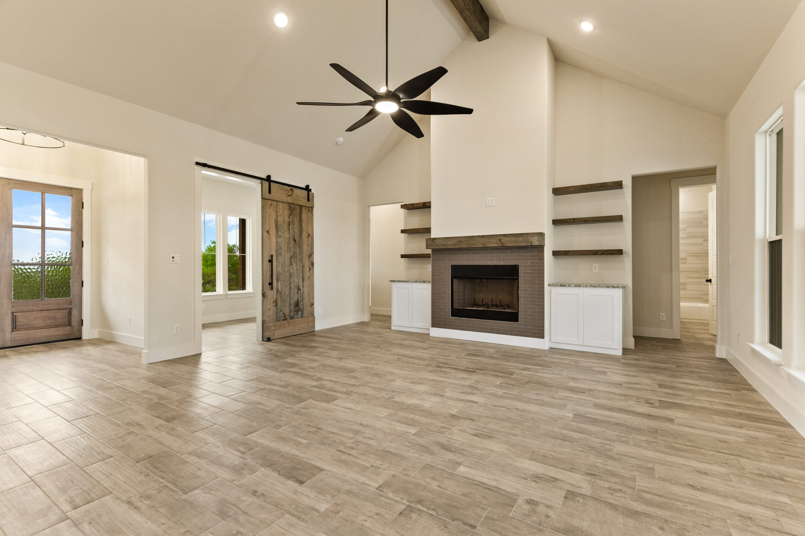
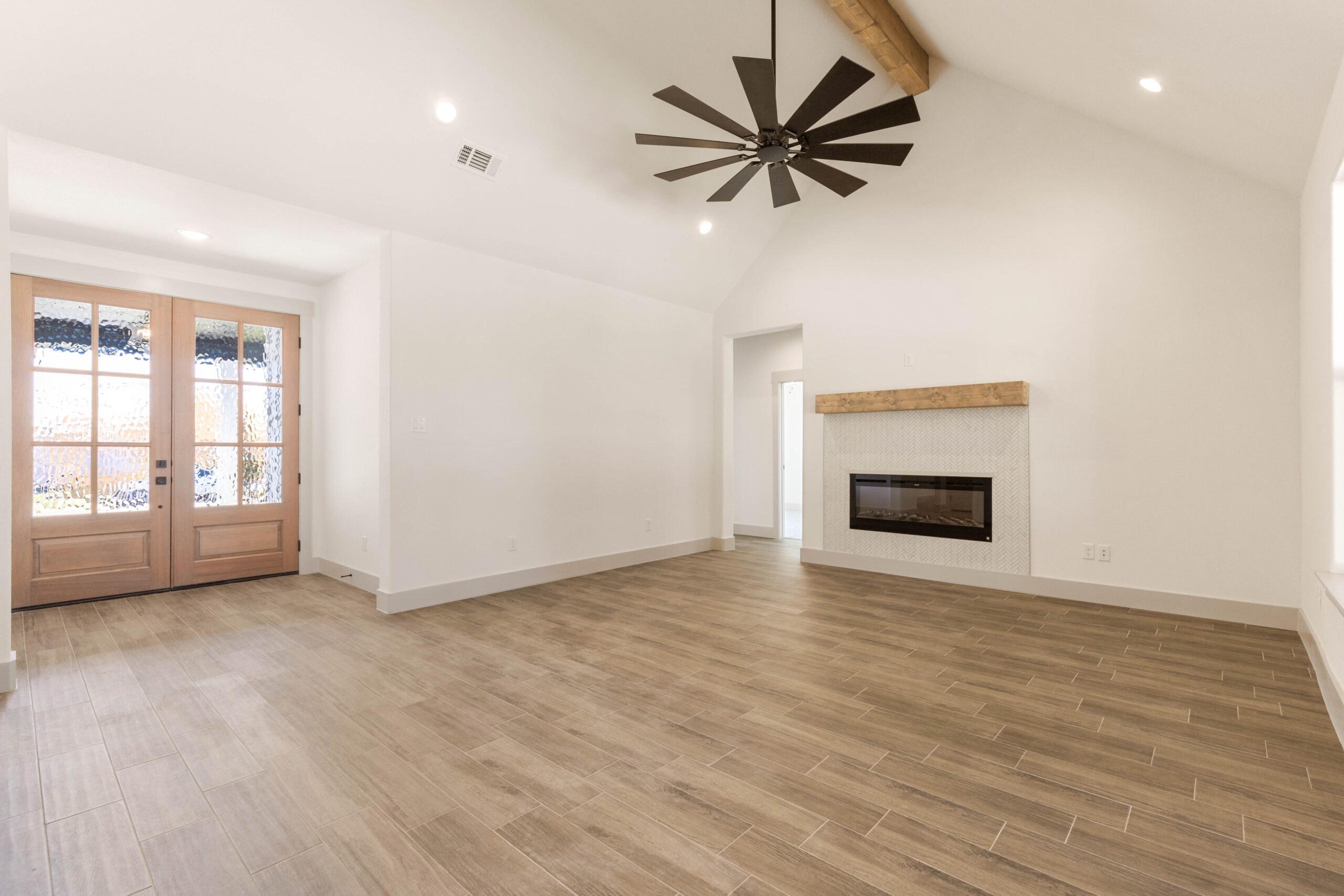
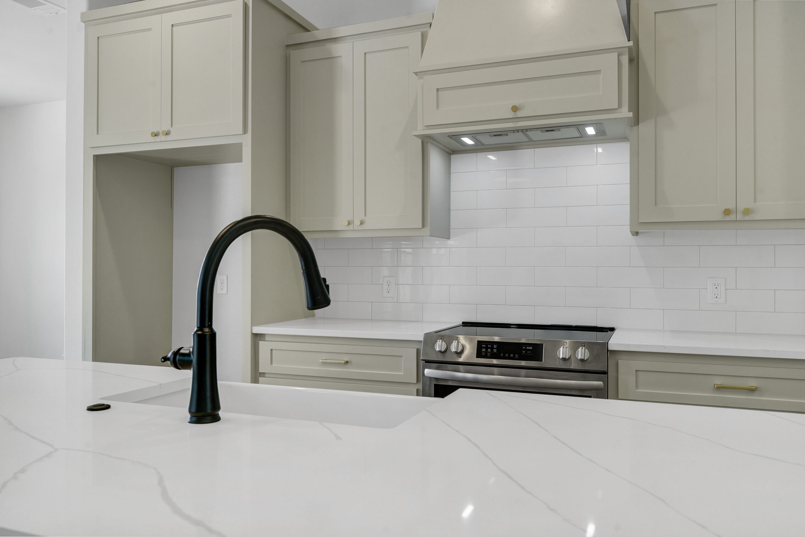
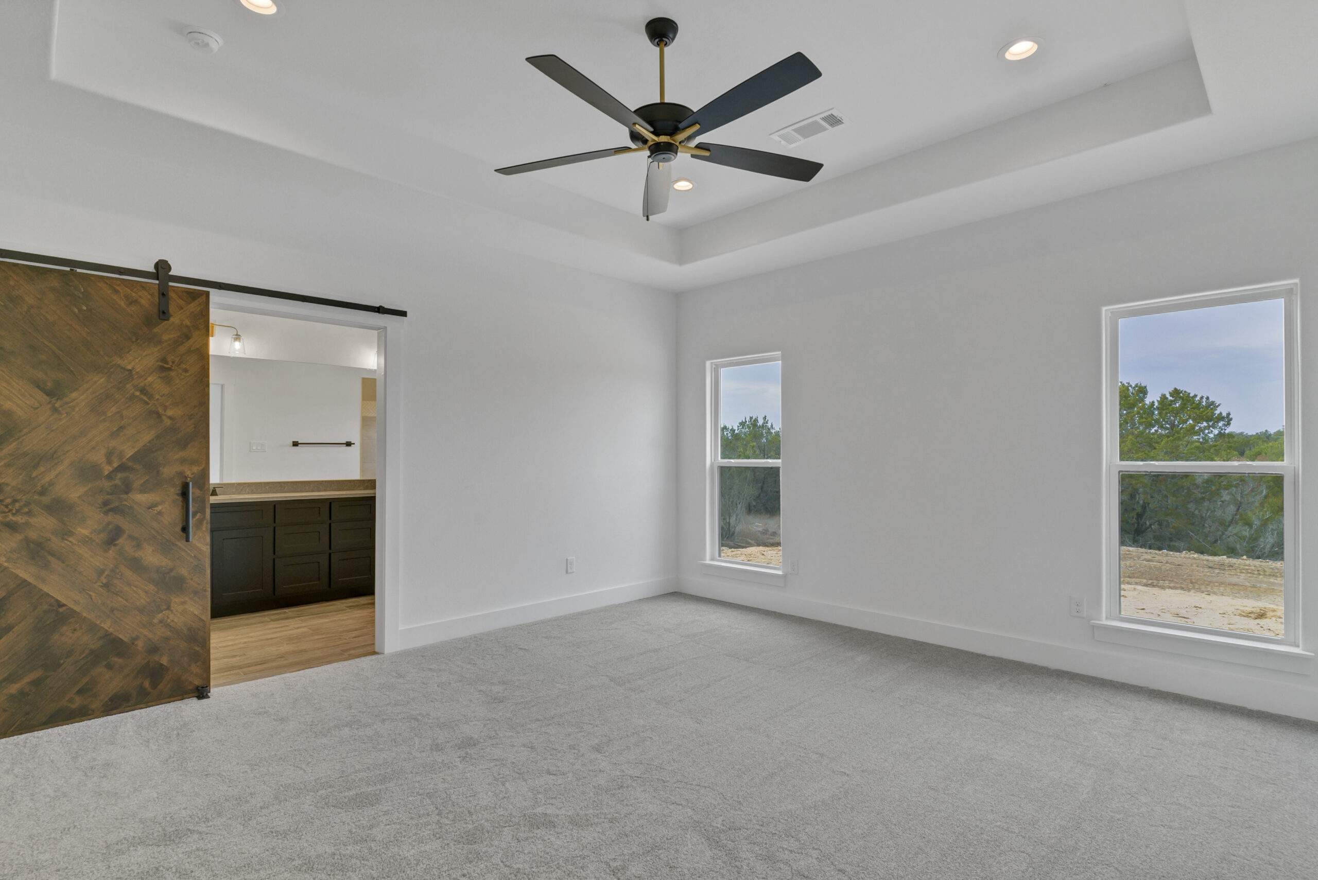
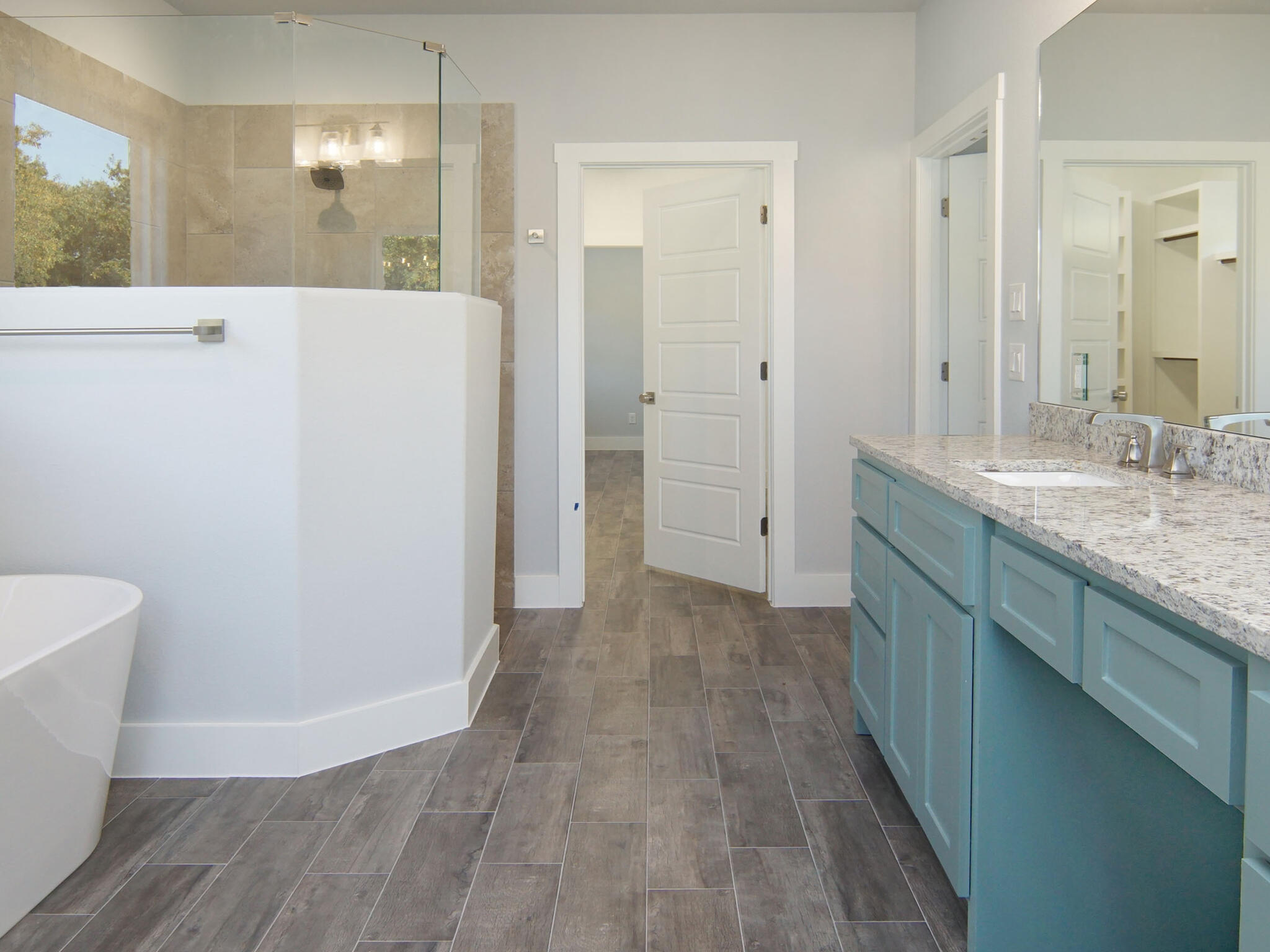
Consider Lighting – Natural and artificial lighting can drastically change how a color appears. Always test samples in different lighting conditions.
- Stick to a Cohesive Palette – A home flows better when colors complement each other rather than clash.
- Balance Bold with Neutral – If you love bold colors, consider using them as accents instead of full-wall coverage.
At True Texas Builders, we’re all about designing homes that not only look beautiful but also feel right. Whether you want a cozy farmhouse-inspired space or a sleek modern retreat, the right paint colors can bring your vision to life. Need help picking the perfect palette for your new home? We’ve got the expertise to guide you every step of the way. Let’s build something beautiful together.